Lana Vanguard Paper. Using Inks and Using Oil Paints.

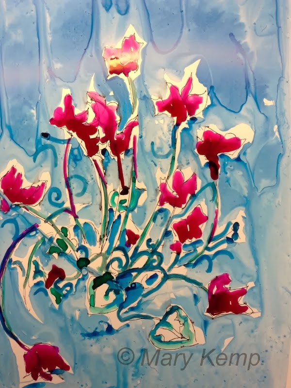
Mary Kemp- Cyclamen.
Ink on Lana Vanguard 
There's a tiny, deep, deep red cyclamen in the studio.
It stands next to a cobalt blue painting and every time my eyes rest upon it my heart zings. The colour combination is just made in heaven.
I've been meaning to paint it for a while now.
This morning I put aside the oil I was working on and got out some smooth and shiny Lana Vanguard paper,  Rowney Daler acrylic ink and a pot of Sennelier crimson ink which has a very high shellac content.
I drew a rough outline with a little gel pen.
After about an hours work this is what I came up with.
I've used inks on this paper before and love the way the ink pools unpredictably  and moves about on the surface.
But then as I was getting another sheet of paper out to have another go I read the blurb on the pad that said it was:
 SUITABLE FOR OILS !!!!!!!
So out came the oil paints. Time to experiment.
Mary Kemp. Cyclamen.
Oil paints on Lana Vanguard paper.
I spent another hour on this painting. I drew in pencil and applied the oil paint without any medium except a very small amount of spirit using my usual brushes. It was a weird sensation, not one I liked very much, the brush slid as soon as I put it on the paper, but the paint glowed with the strong white background. There was a nice blurry effect when I rubbed in the paint with a cloth.
Would I use it again?
I'm not sure. I did like the blurry effect with the cloth. It reminded me a bit of encaustic painting.

The Quest for the Perfect Picture Frame.

I keep searching for the perfect picture frame and on my journey I've come across quite a few that are almost there.
My criteria are simple.
It must make my painting look stunning.
It must be good looking itself but not so good looking as to detract from my art.
It must be tough, able to withstand a bit of handling.
Preferably lightweight.
It must be reasonably priced.

I have been exploring the internet recently and came up with two results.

Mary Kemp. Before the Picnic.
In bespoke frame
The first was frames.co.uk where I ordered a beautiful bespoke picture frame. Delivered by courier in the most sturdy packaging I have ever seen!
It looks the business, and certainly seems tough. But it was expensive, and it is very heavy.


I wanted to try a cheaper option and went for Jacksons frame builder, a sort of diy option .
This was certainly a lot cheaper, a quarter of the cost of the ready made frame but not as luxurious. I think I will have to paint the frames if I don't want bare wood so that will add to the cost. It was easy to put together though and is quite light.
Jackson's diy frame. Work in progress.


Palette Knife Painting. The Upside and the Downside.

Yesterday as I was using a palette knife to add a hefty smear of buff titanium to my latest painting I got to thinking about the pros and cons of this way of working.
Pros:
It's quick.
Adds texture to the surface.
No washing of brushes.
Cons.
Uses a lot of paint.
Not terribly accurate.

The beige and burnt sienna painted with palette knife.
Using a palette knife can add variety to how you work and gives a mark that no amount of brushwork can do. Here I've used it like buttering bread. The texture of the surface is rough so that affects the mark it makes. A smoother surface will see a greater spread.
If you make a mark with the blade you will get a sharp straight edge, often thicker at one end than the other.
There are many sizes and shapes of palette knives. It pays to buy from a good art supplier. I bought several very cheaply and all were rigid and unresponsive. The one in the photo is from Daler Rowney. It's springy and feels good.
I'm not a fan of paintings wholly completed by palette knife, I think they leave too much to chance, but every so often a well aimed smear is just the job.

How Do You Describe Your Art?

How do you describe your art?
Do you have difficulty putting words to what you do?
For some of us visual artists words don't come easily, yet when people ask us about our art we usually have to reply in words, not our preferred way of communicating, pictures.
So it is useful to have a few well chosen phrases in hand when someone utters the dreaded words  "So you're an artist ! What do you do?"
Mary Kemp.
Detail of Boat Awaiting Restoration.
oil on board 30 x 30 
I must admit this question often caught me out , and after much mumbling and muttering I'd produce sentences that consisted mainly of "sort of" , "like", "you know", and "stuff".  "kind of". This was not very professional, and told people, possibly potential clients, absolutely nothing.

So here is my solution.


  • Describe your style.
  • Describe your medium.
  • Describe your subject.
This leads to
" I am a moderately contemporary artist who usually works in oils. I paint family beach scenes, boats and landscapes."
How do you describe yourself ?
All comments welcome.

How to Use a Dark Coloured Background. A Winter's Day at the Seaside.

Mary Kemp. A Winter's Day at the Seaside.
Oil on canvas panel 50 x 40 cms.
How do you depict a day that is bright and full of shadow?
I wanted to show this scene as cold and wintery as well as bright and upbeat.  I felt it needed dark tones but also some contrast.
It needed a dark underpainting.
This is how I did it.
Starting with a white canvas panel measuring 40 x 50 cms I drew a rough outline of my main components in black acrylic paint, let that dry , and then using a dilute black, raw umber and a little ultramarine violet acrylic colour I washed all over the surface, a bit raggedy for variety.
I let that dry and began mixing my oil paints.
I used titanium white, cerulean blue, cobalt blue, ultramarine violet, buff titanium, Naples yellow, burnt Sienna and cadmium red, mostly Windsor and Newton artists quality oil paints. Added to that was  turpentine as a painting medium, but hardly at all as I like my paint dry, and flat and filbert brushes with a palette knife.
It was quite a quick painting to complete, mainly because of the black ground which has the great advantage of defining the edges of where you paint. You are never left with a glaring  embarrassment of white with a dark or coloured underpainting.
The sky was mainly cerulean blue with some cobalt at the edges. I had lain down a strip of masking tape to define the horizon. The clouds were put in using a palette knife and firmly dragging it down.
The sea was layers of cobalt blue and ultramarine violet.
The sand was depicted by very dry buff titanium dragged loosely over the dark ground. I painted the figures and their shadows in quickly. I felt it needed sure strokes. Finally I added some burnt Sienna to the sand.
I was pleased that in my mind the picture showed the day I wanted to share.
Please feel free to add any comments or ask any questions.

The Artists and Illustrators Annual Exhibition. An Interested Artist's View.


Yesterday I made the trip to London specifically to see the  Artists and Illustrators Magazine Artist of the Year 2013 exhibition.
Norman Long. Detail from The Bench.
I had read a lot about it and wanted to see the winners, especially the overall winner by Norman Long The Bench, a painting 366 cms wide by just 40 cms high. It was an impressive picture painted in an assured understated style and in my mind a worthy winner.
Many of the works were less painterly than this, and some I felt had used a lot of photographic reference, ( or am I being just too sceptical?) But one that did catch my eye was this one, by Helen Cassidy.
It is a very  honest picture and very satisfying to view.
Blackthorn by Helen Cassidy
The exhibition was held in the Mall Gallery, in the new Threadneedle Space. There were about 40 pieces in all and they fitted the space comfortably, the light was good as you would expect and it was an enjoyable if small exhibition.
The only sadness was that just one small picture had a red sticker on it. There were no prices on any of the works and there was only a phone number to contact for purchases in the not very comprehensive catalogue.

Let Lomography Influence Your Paintings. Instagram is OK Too!

Being an addict of the point and shoot camera I was mystified as to why any one would want to go back to analogue photography. But then I came across Lomography which has it's origins in eastern European cold war technology and it was blindingly obvious why people just love the images produced, one shot, can't see the result til you print it little gems. I love the blur and shadow round the edges that  comes with vintage lomography and the way the colours can be slightly off kilter making you feel disconnected and nostalgic. All this has crept into way I paint and this picture of the running man is the latest from the studio.
Copyright Mary Kemp. Man Jogging, Carrying Child.
Oil on canvas panel 30 x 30 cms
 Of course if you don't want to go analogue, digital will do, with the wonderful effects from Instagram.

Get Ready for Artists' Open Studios !

It's that time of year again when the form needs to be filled in to enter the summer open studio events. It's not only Peterborough, but up and down the country committees, mostly volunteer, are sending out a call for entries.
Are you ready? The deadline creeps up on us at lot quicker than you think.
At this stage there are only 3 things you need to know to take part where ever in the country you do it.
1. Have I got enough work? Will I have enough work?
2. Have I got a venue, either at home, my studio or in someone else's venue?
3. Am I free on the dates in question?

If your answers are yes then all you have to do is fill in the form and pay the money. At this stage  you'll have calculated that to be part of this brilliant movement is well worth the joining fee.
This is the website for Peterborough Open Studios. Other open studios are available!

Choosing a Sketchbook. What Colours Your Choice?

When I come to think of it I'm pretty picky about choosing a sketch book. There are lots of things that I don't like and a lot more that I count as essential.
Three Sketchbooks.
First of course I have to decide what the sketchbook is for. Sketching of course !!!!!!?  gathering information and practice, but is it on my lap for a leisurely draw of the cat sleeping or on the go, capturing movement in a busy place when I should be doing something else.
Size.Purpose dictates size so I have 3 sketchbooks on the go, 6 inch square, 8 inch square and ten inch square. Anything bigger for me it's too cumbersome . The small one I can slip in my pocket or handbag with a pencil, the other two take a more determined effort to take out and about.
Format. I like a square sketchbook. It's just a personal preference but somehow it seems more pleasing. You can always leave part of the page empty to get the right shape.
Binding. Ring binding seems to work best, despite it being a more expensive option and being bulky. A ring binding lets you keep the page open and flat  and draw right up to edge from any angle. It's a good idea to keep the binding at the top or left ( or right if you're left handed) while you're working to keep it out of the way of your hand.
Paper. There's so much choice out there. It's a question of what feels nice to draw upon. It doesn't have to be archive quality. I like a fairly sturdy nearly white cartridge paper that my pen moves over smoothly and will stand up to a bit of watercolour but I don't mind if it wrinkles a little.
This is how I choose my sketchbook. How do you choose yours?  Leave a comment and tell me what you think is important.
Mary Kemp. Hyacinths.
Pen and watercolour crayon.

Royal Academy Summer Exhibition Online Entry Process.

2014 sees the Royal Academy putting it's selection process for the Summer Exhibition online for the first time. At least as far as 2D and sculpture is concerned, the architecture part has already got there.
It is estimated that this will double the potential entry although numbers are capped at 12,000. Click here for the link.
The aim of putting it online is to make it easier all round, so that we artists don't have to transport work in and out of London unnecessarily, and the Royal Academy can do the first cut on the computer from digital images.
Of course if your work gets past the first cull there is by no means any guarantee it will get selected as they will shortlist up to 4,000 works to be delivered to the Academy for the second round.
This is a first for me too, as I have never entered the Summer Exhibition before, I've visited many a time, but each year I've said I might give it a try and then never got round to it, so making the first round a digital selection was just the encouragement I needed.
This is how I got on so far:
Before the entry date I registered on the Royal Academy website for an email to tell me when the entry forms went on sale.
On Monday 6th the email arrived, and later that day I went to the website and set up my registration, an easy process, and now I was ready to purchase my entry form which would cost £25.00 for one work, £50 for two. I opted for one. But the ability to purchase was down ( too many eager artists possibly?) so I had to wait until later on Tuesday when it all went through quite easily.
Next is to upload up to 3 images of my chosen artwork, which must be one of the whole artwork, and the others either detail or of it framed. I'm just dithering about the frame at the moment. We have until Valentine's day to complete the form.
Has any one else completed the online entry? let me know how you're getting on with it if you have.

Sketch with Watercolour Pencil and Crayon

In the interest of New Year's resolutions, before I got down to painting this morning I drew a quick sketch of part of the view from my studio window.
The twirly things are springs from a Jaguar, overseen by a lion that was left guarding the gate when we bought the house.
Mary Kemp. Drawing from Studio Window.
I used a watercolour Delft blue pencil for the drawing part of this sketch and some watercolour crayons for the other colours. Then just a quick flick of water.
Also in the pursuit of being super organised I downloaded the picture to a brand new folder entitled 2014 Blog. New Year's resolution !

Drying Time of Oil Paints

I use oil paints mostly,  mixed sometimes with alkyd paint, and sometimes I use resin like liquin and of course turps to mix. These  things speed up the drying time of oil paints, but somehow there is nothing like the smooth sumptuousness of artist quality oil paint straight from the tube.
Mary Kemp. One Brother, Two Sisters on the Beach.
oil on canvas panel 30 x 40 cms.
Of course this is all very well until it comes to drying time. There are a few colours that take ages to dry and the white I use most of, titanium white is one of them. Also Naples yellow. This picture I completed well before Christmas and it's still not dry. I slapped the paint on freely and quickly. It has also been in my studio over the holiday period and it's pretty chilly there so that won't have helped.

Oh No! Not Another List of New Year Resolutions!

I am sitting in my studio. This seems to be the first quiet time I've had since before Christmas. I am truly blessed with wonderful family and friends which leads to a lot of celebrations and a copious amount of food and drink.
So New Year's resolutions of course include less food and drink.
I'll keep the family and friends thank you very much,
but what I really must do is DRAW EVERY DAY.
Drawing Kit.
 2 sketchbooks, pencil case full of...pencils.
Coloured pencils, sharpener, rubber etc.
I must also organise my time better and not get diverted from my reason for getting up in the morning.......painting (and of course family and friends).
I aim to get my work out there more. I have virtually finished the big inventory of my paintings so I have no excuses.
Onwards 2014 !!!


How to Care for Prints

Dear fellow art lovers, I'm often asked by busy customers how to look after their prints once they've bought them. Prints are a ...