Only one thing to say this week.
HAPPY CHRISTMAS !
No words of wisdom, or flashy photos, only wishing you all a happy Christmas time with those you love.
Mary x

The art blog of Mary Kemp Impressionist artist, painter of the seaside, sometimes with families and dogs, especially border collies.
The Seven Things I Really, Really Want For Christmas.
I'm a pretty contented sort of person. I take life as it comes if you know what I mean. But every so often I go off into a little daydream and my latest day dream involved what I'd really like for Christmas. I expect you do pretty similar. I wonder if it's anything like mine.
Recipe For A Painting. Bird Table With Flags.
In my garden is a pale blue bird table. It just so happens it matches the studio exterior, but only because there was some paint left over.
Another interesting fact about the bird table is
Another interesting fact about the bird table is
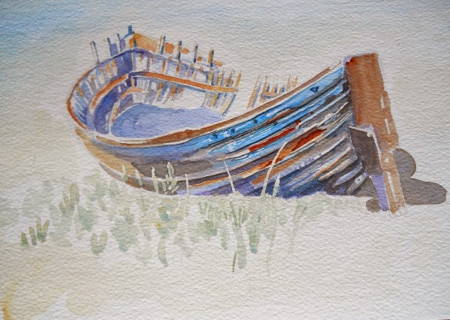
Painting and Drawing Boats.
I paint a lot of boats, not being sure why they hold such an attraction for me.
I'm rubbish on the water, in fact I'm downright scared of it, so I don't often actually go on boats very often, especially the sort that are nice to paint and draw, small and a bit ragged at the edges.
One of my favourite occupations is sitting on the harbour wall, watching the world go by and doing the odd sketch or two.
The shape of a boat is difficult to get to grips with because although the left and right are usually the same back and front are so individual.
There's loads of books on the subject and here's two really useful bits of advice.
When I get home to the studio after a sketching session I paint what I have seen, aided by the sketches, and relive the moment again.
Bright winter day on the Norfolk coast. They sailed away before I could do more than a few hurried drawings, but I took photos.
I'm looking forward to next year for many happy hours with a sketchbook by the sea.
 |
| Click to buy! A boat in Galicia. |
 |
| Bit ragged at the edges! |
The shape of a boat is difficult to get to grips with because although the left and right are usually the same back and front are so individual.
There's loads of books on the subject and here's two really useful bits of advice.
- Draw a box and then draw the boat to fit in .
- The body of a boat is a figure 8.
.jpg) |
| Click to buy! |
Bright winter day on the Norfolk coast. They sailed away before I could do more than a few hurried drawings, but I took photos.
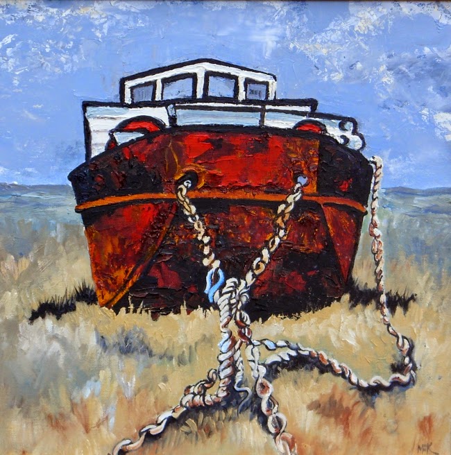 |
| Click to buy! This boat on Bancaster salt marshes has been there for years and I've painted it many times. I love all the rust! |
Five Golden Guidelines For Busy Artists.
Well you know how it is.
Not enough hours in the day.
Too many ideas fizzing in your brain.
Too much domestic stuff to do.
And you're tired......
I hold my hands up right now in that I pinched this idea for some golden guidelines from the wonderful Katherine Tyrrell at Making a Mark, In fact she actively encouraged it with her blog post of the ten golden rules for every busy artist.
But I've written just five guidelines for us
Not enough hours in the day.
Too many ideas fizzing in your brain.
Too much domestic stuff to do.
And you're tired......
 |
| DO NOT PAINT IN YOUR GOOD CLOTHES !! |
I hold my hands up right now in that I pinched this idea for some golden guidelines from the wonderful Katherine Tyrrell at Making a Mark, In fact she actively encouraged it with her blog post of the ten golden rules for every busy artist.
But I've written just five guidelines for us
Time Management. An Update.
It always fascinates me how other people manage their time. I read artist's biographies and listen to them talking on the television.
What sticks out for the most successful, notorious artists is their absolute devotion to their art, to the exclusion of everyone and everything else.
You've got to put the hours in!
Not only to the art but to the putting it out there. One of the most successful artists I know prides herself in painting just one day a week. The rest of her time she spends promoting her work, prints, original paintings, cushions, mugs ,cards and all sorts of merchandise. A little bit of art can go a long way!
As far back as June I wrote a post describing my weekly schedule, and this in a way is an update on that.
Although I wouldn't go quite as extreme as my super marketing friend I do recognise you need to spend time on marketing efforts. To such an end I ditched one of my two going-to-work-and-getting-a-wage type days in favour of staying at home and doing the paperwork and the on-line stuff.
It's sort of worked.
I really look forward to going to work one day a week now, and the finances aren't too bad.
I've painted more than anything else even though I said I was going to spend more time on the business side of my art practice.
I still can't paint to the exclusion of everything else. The domestic work needs to be done, and the burden falls on me. I just cannot bring myself to ignore it, and this I suspect is my downfall.
I once heard a female artist being interviewed on the radio. "I would have been more successful if I'd had a wife to look after me" she said.
But life has to be rounded, and a life spent simply painting would be dull......Or would it?
What sticks out for the most successful, notorious artists is their absolute devotion to their art, to the exclusion of everyone and everything else.
 |
| Hours and hours and hours..... |
You've got to put the hours in!
Not only to the art but to the putting it out there. One of the most successful artists I know prides herself in painting just one day a week. The rest of her time she spends promoting her work, prints, original paintings, cushions, mugs ,cards and all sorts of merchandise. A little bit of art can go a long way!
As far back as June I wrote a post describing my weekly schedule, and this in a way is an update on that.
Although I wouldn't go quite as extreme as my super marketing friend I do recognise you need to spend time on marketing efforts. To such an end I ditched one of my two going-to-work-and-getting-a-wage type days in favour of staying at home and doing the paperwork and the on-line stuff.
It's sort of worked.
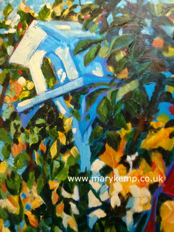 |
| Birdhouse detail . It's telling really that a lot of my paintings have a domestic theme! |
I've painted more than anything else even though I said I was going to spend more time on the business side of my art practice.
I still can't paint to the exclusion of everything else. The domestic work needs to be done, and the burden falls on me. I just cannot bring myself to ignore it, and this I suspect is my downfall.
I once heard a female artist being interviewed on the radio. "I would have been more successful if I'd had a wife to look after me" she said.
But life has to be rounded, and a life spent simply painting would be dull......Or would it?
Painting En Plein Air. Everyone Knows That It's Different For Girls.
This is what happens if you're a man.
You decide you want to do a bit of open air painting or drawing. You get up, throw on your old work clothes, gather together your painting kit and off you go.
Town or country you get yourself in a good spot nicely settled and get on with it. If any one approaches you, unless you want a chat, you glare at them and they go away.
But every one knows it's different for girls.
You decide you want to do a bit of open air painting or drawing. You get up, throw on your old work clothes, gather together your painting kit and off you go.
Town or country you get yourself in a good spot nicely settled and get on with it. If any one approaches you, unless you want a chat, you glare at them and they go away.
 |
| Eastfield Allotments. Mary Kemp. |
But every one knows it's different for girls.
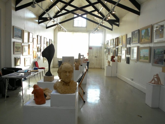
Peterborough Arts Society Autumn 2014 Exhibition. A Personal View.
The 85th Anniversary Autumn Exhibition of
St. John's Church, Cathedral Square, Peterborough .
12th to 22nd November 2014.

It was busy, successful and vibrant, and some of the ladies were very intimidating!
There was a strict criteria to be an exhibiting member, and sales at shows were good.
4 Really Good Art Blogs.
I am going to tell you about 4 of the best, most informative and colourful art blogs I've come across in my travels in cyberspace.
And if you have a favourite blog I'd like to hear about that too.
 |
| Mary Kemp. Brancaster. Detail. |
Monsal Head in Derbyshire. Take My Breath Away!
Sometimes you visit somewhere that makes you gasp!
It takes your breath away, and reminds you just how big and plain amazingly awesome this funny old world is.
For me Monsal Head in Derbyshire was such a place.
The wind was blowing, the clouds scudding across the sky. I felt I could just jump up and the wind would take me up and away!
It takes your breath away, and reminds you just how big and plain amazingly awesome this funny old world is.
For me Monsal Head in Derbyshire was such a place.
 |
| Monsal Head, Derbyshire |
I drew this picture in my sketchbook with a thick pencil. It only took a few minutes.
Here's the painting completed back in the studio.
That took a bit longer!
Available from Rippingham Art
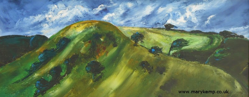 |
| "Take My Breath Away!" Mary Kemp. Oil on canvas. 60 x 25 cm. |
Colour Rules The World ! O.K.
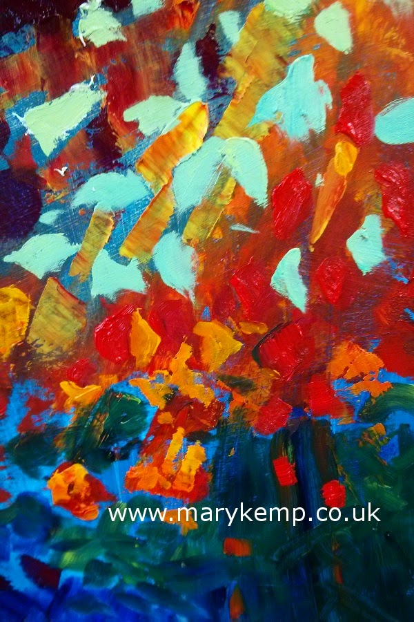 |
| Red, yellow, blue, green. Loads of colour! |
Sometimes I restrict my palette, and for a day or two that seems quite calming and somehow appropriate to a person of my rather conventional outlook on life.
( You know the sort of thing, wash up after every meal, pay your bills on time, always be polite)
And it's not as though it happens whether I'm happy or sad, angry or bored. It just happens.
In my previous blog I talked about recording a visit to Northumberland, and how I painted that. "This is serious painting" I thought. Grown up painting. Possibly, if I'm being a bit gender stereotypeish, this is how men paint. Not that I want to paint like a man. I don't.
I quite liked the result though.
 |
| Southwold Lighthouse. Mary Kemp. Detail.Oil on canvas panel.30 x 40cm |
And then I thought I'd paint another. And I did.
And then another.
But I couldn't. I looked at the palette and felt a bit dreary and so I gave in and this is the result.
 |
| Colour, colour, colour ! |
If I'm to be honest I think I'll just have to follow my instinct and keep company with bright colours. I don't seem to be able to maintain anything too tasteful for very long.
p.s. Can you see the bright red canvas to the left of the easel? Here lies a whole new story!
How Edward Seago Made Sense of My Northumberland Seaside Holiday.
I've been searching for a way to document my holiday in Northumberland with the family. I've taken all the photos, done a few quick sketches but I want to paint some pictures that give me the real story of the wide open beaches and majestic hills.
The optimistic colours of previous holidays are too bright and eternally summery. This was not a summery summer holiday. Oh no.
What I needed was a palette of colours to reflect the diabolical weather that we had, with unremitting wind and quite a bit of rain.
And this was August!
I don't want you to think we had an equally awful holiday, because we didn't. We had great fun. And as they say there's no such thing as bad weather just
 |
| From Lindisfarne ( Bamburgh Castle is somewhere on the horizon) |
What I needed was a palette of colours to reflect the diabolical weather that we had, with unremitting wind and quite a bit of rain.
And this was August!
I don't want you to think we had an equally awful holiday, because we didn't. We had great fun. And as they say there's no such thing as bad weather just
Peterborough City Gallery. Two Very Different Exhibitions. October 2014.
Peterborough in Cambridgeshire has a museum that in the early 20th century was a hospital, and in that museum is a charming gallery that consists of three large airy rooms.
Have you been there? What do you think?
On Tuesday lunchtime I visited The City Gallery there with the expressed intention of seeing Julie Reid's exhibition "Fabric of the Earth".
But first I had to get to it.
Welland Valley Art Society Autumn Exhibition 2014
The Wilfred Wood Gallery in Stamford Art Centre , where the Welland Valley Art Society hold there exhibitions, is a magnificent light and spacious venue.
The ceiling is high, there's lots of uninterrupted white wall space , the natural lighting is good and the artificial lighting is plentiful. And it's warm!
I've been taking part in the Welland Valley's exhibitions for some years now and always feel quite proud to show my paintings alongside such great work.
So here are my thoughts on this year's offerings.
 |
| Wilfred Wood Gallery, Stamford Arts Centre |
The ceiling is high, there's lots of uninterrupted white wall space , the natural lighting is good and the artificial lighting is plentiful. And it's warm!
I've been taking part in the Welland Valley's exhibitions for some years now and always feel quite proud to show my paintings alongside such great work.
So here are my thoughts on this year's offerings.
Pre Website Procrastination.
I had planned to put the finishing touches to my website first thing on Wednesday, but the day dawned with such promise, the autumn air soft and bright , that the only thing to do was to get out in the garden and do some pre winter tidying up.
My not so old plum tree was full of mummified plums this year - not nice- so I knew it was time for drastic measures. Apparently there are no domestic chemicals that will cure what is known as brown rot so it was time for good old fashioned garden hygiene.
It seemed sacrilege to hack away at the old tree and get rid of all it's contorted character, but it had to be done.
Because it stood just outside the studio window I've drawn it many times, mostly in the winter.
And this is it now.
So afterwards I got on with the website.
My not so old plum tree was full of mummified plums this year - not nice- so I knew it was time for drastic measures. Apparently there are no domestic chemicals that will cure what is known as brown rot so it was time for good old fashioned garden hygiene.
It seemed sacrilege to hack away at the old tree and get rid of all it's contorted character, but it had to be done.
Because it stood just outside the studio window I've drawn it many times, mostly in the winter.
 |
| Mary Kemp. Plum tree in winter. Pen on cartridge paper. You can see it's very twisty. |
 |
| Not much left. |
The Sadness of Finishing a Painting, and How Long it Took.
I have almost finished this painting.
 |
| Mary Kemp. Late Summer Greenhouse. Oil on canvas panel. 60 x 50 cm. |
It's up from the studio into the house and over the coming days I will look at it, think about it and make any adjustments necessary.
As always, and stupidly, I feel sad when finishing a painting and totally without purpose.
And along comes the thought that I needn't have bothered, and it's all full of mistakes, and it's awful and boring and amateurish and no one will like it anyway.
Does any one else feel like that?
I need time to see it in perspective.
Or perhaps it's rubbish anyway.
To cheer myself up a bit I let loose a splurge of magenta acrylic over a new board, and roughly blocked out a future masterpiece. On wards and upwards.
But my heart is still on this old painting. It has need of a bit more loving care before being finally chained down in a frame.
It's been entered in a local art exhibition in Stamford, and I hope it gets selected. The standard is quite high.
I've never done this before but this time when I painted I recorded the hours spent on this picture.
Postcards for the Eastern Open 2014
I am entering the Eastern Open 2014.
On Saturday I took two pictures down to the Haddenham Gallery just north of Cambridge and am hoping for the best.
Selection for the Eastern Open is quite untraditional so I'm not sure if my work will fit in, stand out!?
However part of the joy of this exhibition is we can submit artist's postcards, which will be exhibited regardless of the fate of your main works.
So I am painting two very tiny boat pieces.
I'm using acrylic which are driving me mad because they dry before I expect them to. Ho Hum. But I've also added Sharpie pen, and I quite enjoy that. It just glides over the surface.
I'll post the result on my Facebook Page!
On Saturday I took two pictures down to the Haddenham Gallery just north of Cambridge and am hoping for the best.
Selection for the Eastern Open is quite untraditional so I'm not sure if my work will fit in, stand out!?
However part of the joy of this exhibition is we can submit artist's postcards, which will be exhibited regardless of the fate of your main works.
So I am painting two very tiny boat pieces.
I'm using acrylic which are driving me mad because they dry before I expect them to. Ho Hum. But I've also added Sharpie pen, and I quite enjoy that. It just glides over the surface.
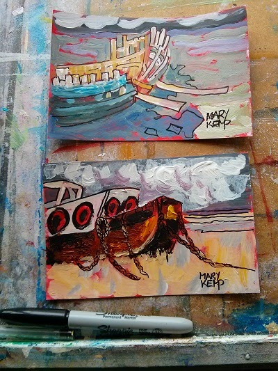 |
| Mary Kemp Boats Acrylic and Sharpie |
I'll post the result on my Facebook Page!
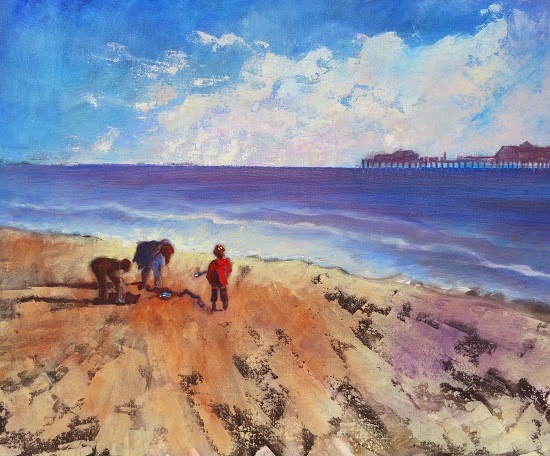
Art by the Seaside.
Summer has been taken up with quite a few visits to the seaside.
There seems to be an invisible cord that pulls me towards waves and sand.
I walk on the beach, I poke about in seaside towns, what more could you ask of life?
I suppose at some stage I ought to knuckle down and do some real work, but until then here are a few works of art I've seen at the seaside.
There seems to be an invisible cord that pulls me towards waves and sand.
I walk on the beach, I poke about in seaside towns, what more could you ask of life?
I suppose at some stage I ought to knuckle down and do some real work, but until then here are a few works of art I've seen at the seaside.
 |
| Clock, Southwold Pier. |
Back in the Studio
Oh it's great to be back to the old routine.
Somehow even though we have no children to look after summer seems to have been taken up with, well, summer.
On the plus side, I have gathered so much material that in my head there are a zillion paintings all waiting to burst onto the canvas.
Somehow even though we have no children to look after summer seems to have been taken up with, well, summer.
On the plus side, I have gathered so much material that in my head there are a zillion paintings all waiting to burst onto the canvas.
The Joy of a Square Painting.
In case you hadn't noticed I love to paint square paintings, to me there is a joy in the symmetry of a painting that has equal sides, top, bottom, left, right.
There are practical advantages too.
Of course there are disadvantages.
But these are minor gripes.
I've been searching through my books to find square paintings in history. (Google wasn't much help because it kept showing me paintings of squares by Mondrian.)
There weren't many, which left me wondering , am I the odd one out here?
But I did find Gustav Klimt's Kiss, and Hans Holbein's The Ambassadors is nearly square, so all is not lost.
And here, for your delectation, is one of my own square paintings, a favourite.
Click here to view details.
Somehow it is complete within itself, all encircling , all enclosing.
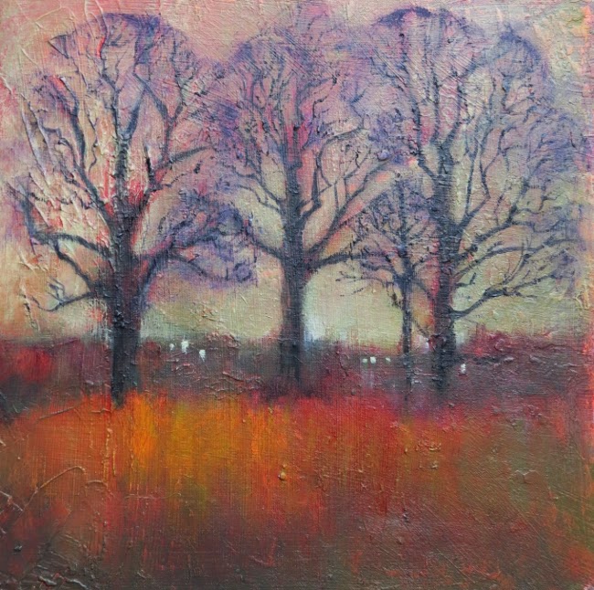 |
| Mary Kemp. Three Trees in a Russet Field. Oil on canvas panel. 30 x 30cm |
There are practical advantages too.
- If you start with a square doodle it will scale up nicely to whatever size you have. No more messing around with mathematical calculations for a canvas that is too long or too short.
- And if you have a work that needs a mount, well any frame bigger will do, you don't have to battle with proportions and perhaps loose a little of your composition.
Of course there are disadvantages.
- The internet can be unkind to square images.
- Facebook cuts them off at the knees.
- If I list on Etsy I have to put a square image on a landscape shaped background so it can be seen in its entirety at first.
But these are minor gripes.
I've been searching through my books to find square paintings in history. (Google wasn't much help because it kept showing me paintings of squares by Mondrian.)
There weren't many, which left me wondering , am I the odd one out here?
But I did find Gustav Klimt's Kiss, and Hans Holbein's The Ambassadors is nearly square, so all is not lost.
And here, for your delectation, is one of my own square paintings, a favourite.
Click here to view details.
 |
| Mary Kemp Tea Time |
What To Do in Northumberland. Newbigging By the Sea Art Trail.
Oh we've been on holiday. In the glorious north east, in Geordie land where everyone speaks with a beautiful rich sing song accent and the wind blows like billio. Big skies, loads of castles, Hadrian's Wall and Beamish Museum. We had a great time and now I'm ready for a rest, but my mind is so full of what I've seen I might just have to get down to work pretty sharpish.
While we were away, to humour me, my family took a detour into Newbiggin by the Sea to view a splendid off shore sculpture and see what other delights Newbiggin had to offer.
I hope Newbiggin won't be offended if I say how cold and
 |
| "Couple" by Sean Henry 20007. |
I hope Newbiggin won't be offended if I say how cold and
Studio Snaps.
It's holiday season so nothing too taxing.
My head is full of sea and sand, and family and new places to explore.
So here are some studio snaps.
My head is full of sea and sand, and family and new places to explore.
So here are some studio snaps.
 |
| Tidy! |
Peterborough Open Art Exhibition, 2014. A Personal View.
Before I say anything else I have to admit that I entered two paintings for this exhibition. One was accepted, one wasn't. I was not a prize winner but I can take that on the chin.
Not everyone recognises my stellar talent!
The exhibition is on at Peterborough Museum until September 21st., 2014.
Click here for the link to the museum's site although there is nothing about the exhibition apart from dates and an invitation to take part even after the exhibition is well into it's run.
( Or am I missing something?)
It would have been nice to see the prize winners on the site.
First Prize went to photographs by Nisha Keshav, beautiful snow scenes of Holme Fen.
The Two Runner Up Prizes went to Graham Ward, fabulous bright canvases of the Rockability Bus., and Peter Cley's "Babel in the Precincts" a very erudite collage.
The private view was held in the light and airy galleries of the museum which on that night belied their appearance because it was boiling hot! But apart from that it was a very agreeable event.
I liked the hanging of the exhibition. It was well spaced out giving each piece the room to shine . The galleries in the museum are an agreeable showcase for any art.
My favourite pieces:
Not everyone recognises my stellar talent!
The exhibition is on at Peterborough Museum until September 21st., 2014.
Click here for the link to the museum's site although there is nothing about the exhibition apart from dates and an invitation to take part even after the exhibition is well into it's run.
( Or am I missing something?)
It would have been nice to see the prize winners on the site.
First Prize went to photographs by Nisha Keshav, beautiful snow scenes of Holme Fen.
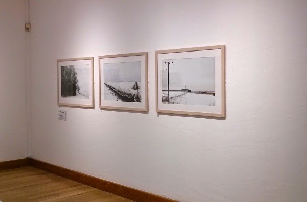 |
| Nisha Keshav's three photographs. |
The Two Runner Up Prizes went to Graham Ward, fabulous bright canvases of the Rockability Bus., and Peter Cley's "Babel in the Precincts" a very erudite collage.
The private view was held in the light and airy galleries of the museum which on that night belied their appearance because it was boiling hot! But apart from that it was a very agreeable event.
I liked the hanging of the exhibition. It was well spaced out giving each piece the room to shine . The galleries in the museum are an agreeable showcase for any art.
My favourite pieces:
- Neil Westwood "Woolwich Power Station", a striking oil painting.
- Sue Shields "Wanderlust" Cut paper and steel, huge and intricate and inexplainable.
- Geri Waddington "Cabbage", lovely resin engraving.
- Karen Harvey. "Untitled. Reading Room Series". A photograph of a doll in Wisbech museum.
This was a fairly modern exhibition, not much room for traditional watercolours!
Roughly half were "painting and drawing". The other half was a mixture of multi media, sculpture, photographs, printing and one video.
But that's art for you, I suppose.
Some Beautiful Art? Changing My Etsy Shop Name.
By the time you read this I will have probably done the deed.
OK. It's not a big deal, but it is to me and I've been brooding over this for a while now.
I need to rename my Etsy shop. Well I think I do.
What do you think?
I call it by my name Mary Kemp which means a lot to me and my family and a few of my collectors but in the wider world it's not a great selling point.
So I thought I would change it.
My first preference was Beautiful Art, but guess what, someone else has got there first.
Which is a shame because I rather liked it.
So I've been thinking of a few more names.
OK. It's not a big deal, but it is to me and I've been brooding over this for a while now.
I need to rename my Etsy shop. Well I think I do.
What do you think?

I call it by my name Mary Kemp which means a lot to me and my family and a few of my collectors but in the wider world it's not a great selling point.
So I thought I would change it.
My first preference was Beautiful Art, but guess what, someone else has got there first.
Which is a shame because I rather liked it.
So I've been thinking of a few more names.
Seduced by Acrylic Paint.
There I go again! I've been seduced by acrylics for the umpteenth time.
It happens every so often. I think "Why am I using oils colours?
Here's my latest picture.
Of course I like the colours, which were bright and bold, but I struggle to get the paint to lie as I want it to. It feels sticky, and the surface seems to me to be lacklustre, and although I have difficulty telling the difference between other people's oils and their acrylics , with my own the difference is obvious. I feel I can express myself better with oils.
Speed and immediacy for acrylics.
Time to craft your painting, and the indefineable charm of oil paints.
No contest.
It happens every so often. I think "Why am I using oils colours?
- They're messy.
- They're expensive
- And they take forever to dry".
Here's my latest picture.
 |
| Mary Kemp.Boats in Galicia. Acrylic on board 40 x 30 cm. I was attracted to the bright day and the strong colours, so typical of Spain. |
Of course I like the colours, which were bright and bold, but I struggle to get the paint to lie as I want it to. It feels sticky, and the surface seems to me to be lacklustre, and although I have difficulty telling the difference between other people's oils and their acrylics , with my own the difference is obvious. I feel I can express myself better with oils.
- Acrylics are hasty to dry and blend clumsily on the canvas.
- They stick to your equipment.
- They're not as classy as oils.
- This picture took less time to complete, giving it more immediacy.
- I can layer colours without needing to wait 2 days.
Speed and immediacy for acrylics.
Time to craft your painting, and the indefineable charm of oil paints.
No contest.
14 Things I Bought at Peterborough Artists Open Studios 2014.
One of the delights of opening up your studio for just one weekend out of three of our Peterborough open studios event is that you have time to visit other artists.
We set aside last Saturday to do just that and what a lovely, enjoyable time we had of it!
Of course you never get round as many as you think you will but we still manage three venues.
This is who we visited on our jaunt out and here is the haul I came home with.
We set aside last Saturday to do just that and what a lovely, enjoyable time we had of it!
Of course you never get round as many as you think you will but we still manage three venues.
This is who we visited on our jaunt out and here is the haul I came home with.
A Weekend of Open Studios.
I open up my home to the discerning art appreciating public, and what do my visitors come to see ?
Only my garden and the three cats! Oh well. I love them too , and my visitors did take time to look at the artwork and even take home a painting or two.
There are three phases to an open studio event.
Only my garden and the three cats! Oh well. I love them too , and my visitors did take time to look at the artwork and even take home a painting or two.
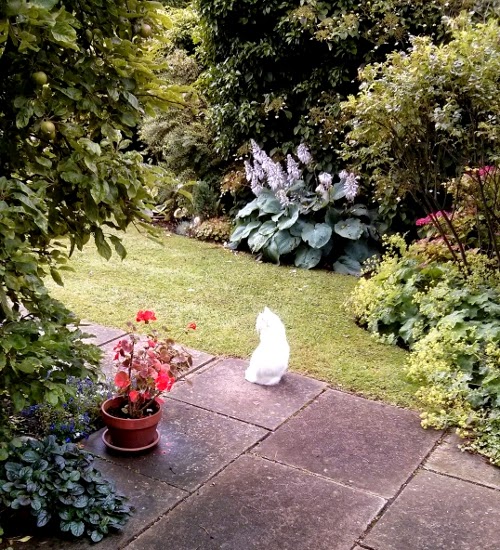 |
| Bertie the cat. I'm rather proud of the hosta in the background ! |
Recipe for a Successful Painting Trip.
For the past few years I've enjoyed an annual painting trip with a group of friends, some, it has to be said, more interested in art than others !
Whilst the idea of the trip is to do some sketching and gather material for future work it always feels more like a holiday than serious work.
But I invariably come home with loads of ideas and not an inconsiderable amount of sketches. The weather dictates the number of photos to drawings as we're not a hardy bunch! and most of our sketches have been done in a comfortable spot out of the wind.
This latest expedition got me thinking about the things that make a successful painting trip and I've come up with a few ideas...
 |
| Taking photos after a sociable evening meal, catching the light on the cliffs before the sun goes down. |
But I invariably come home with loads of ideas and not an inconsiderable amount of sketches. The weather dictates the number of photos to drawings as we're not a hardy bunch! and most of our sketches have been done in a comfortable spot out of the wind.
This latest expedition got me thinking about the things that make a successful painting trip and I've come up with a few ideas...
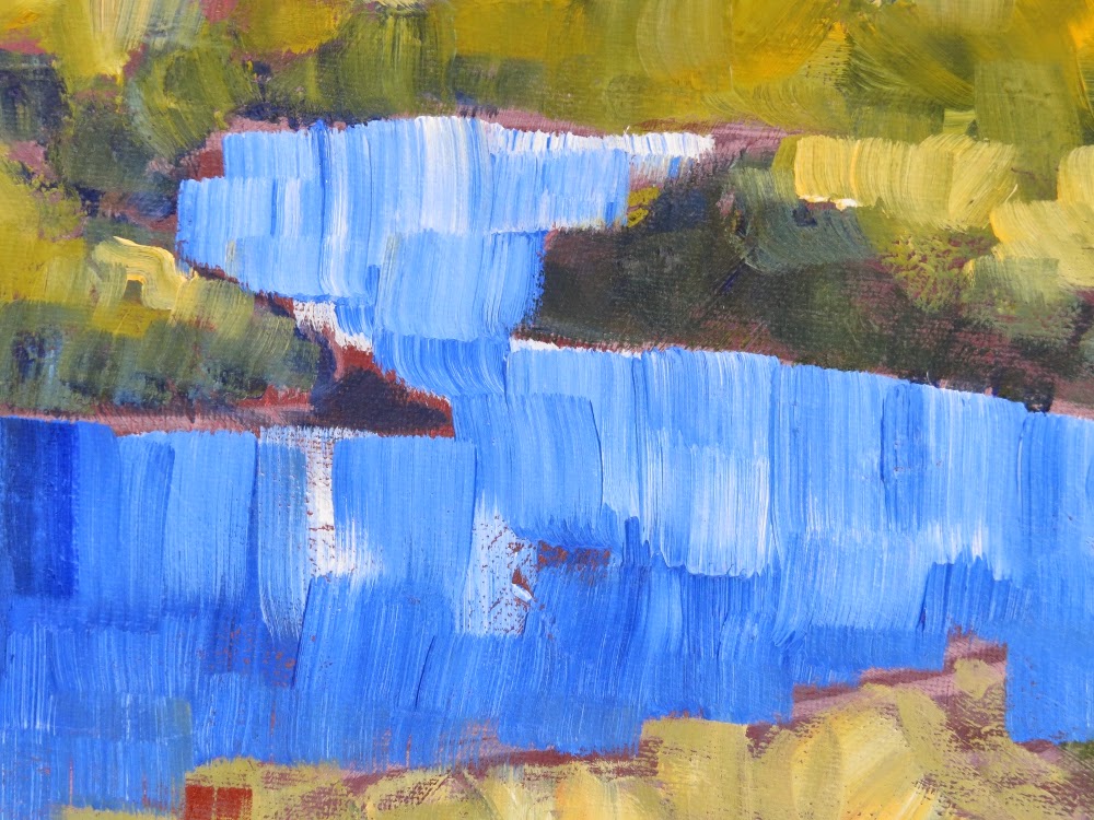
Painting the Sea.
I'm always experimenting when painting the sea. It has so many different guises, so many different moods that I'm at a loss as to how to depict it. Sometimes it's as much about how you feel as how it looks.
Here are just a few snippets from some of my paintings, with a bit of explanation.
Here are just a few snippets from some of my paintings, with a bit of explanation.
 |
| Purple ground with cobalt blue and cerulean blue loosely brushed over. The foam is titanium white with a touch of raw sienna and cadmium yellow, very thickly applied. |
 |
| Dark grey ground with cobalt blue and cerulean blue scraped on. White, raw sienna and cadmium yellow dabbed on. |
Countdown to Open Studios.Three Last Minute Things To Do Before Throwing Open Your Doors.
Oh gosh , oh gracious, oh goodness, how time flies and it's almost time to welcome the public and a few good friends into my studio.
There's loads of little jobs to be done and I'm in a panic because the list seems to be growing and growing each time I think about it, and really I'm not sure if my work is worth looking at anyway and of course I HAVE TO CLEAN THE HOUSE !
If you've ever opened your home up for the joyous event that is Open Studios you will know what I mean.
So I'm going to share with you three last minute things that worked in previous years for me.
 |
| House Through The Trees on a Stormy Day is a picture I'm varnishing in preparation for open studios. |
If you've ever opened your home up for the joyous event that is Open Studios you will know what I mean.
So I'm going to share with you three last minute things that worked in previous years for me.
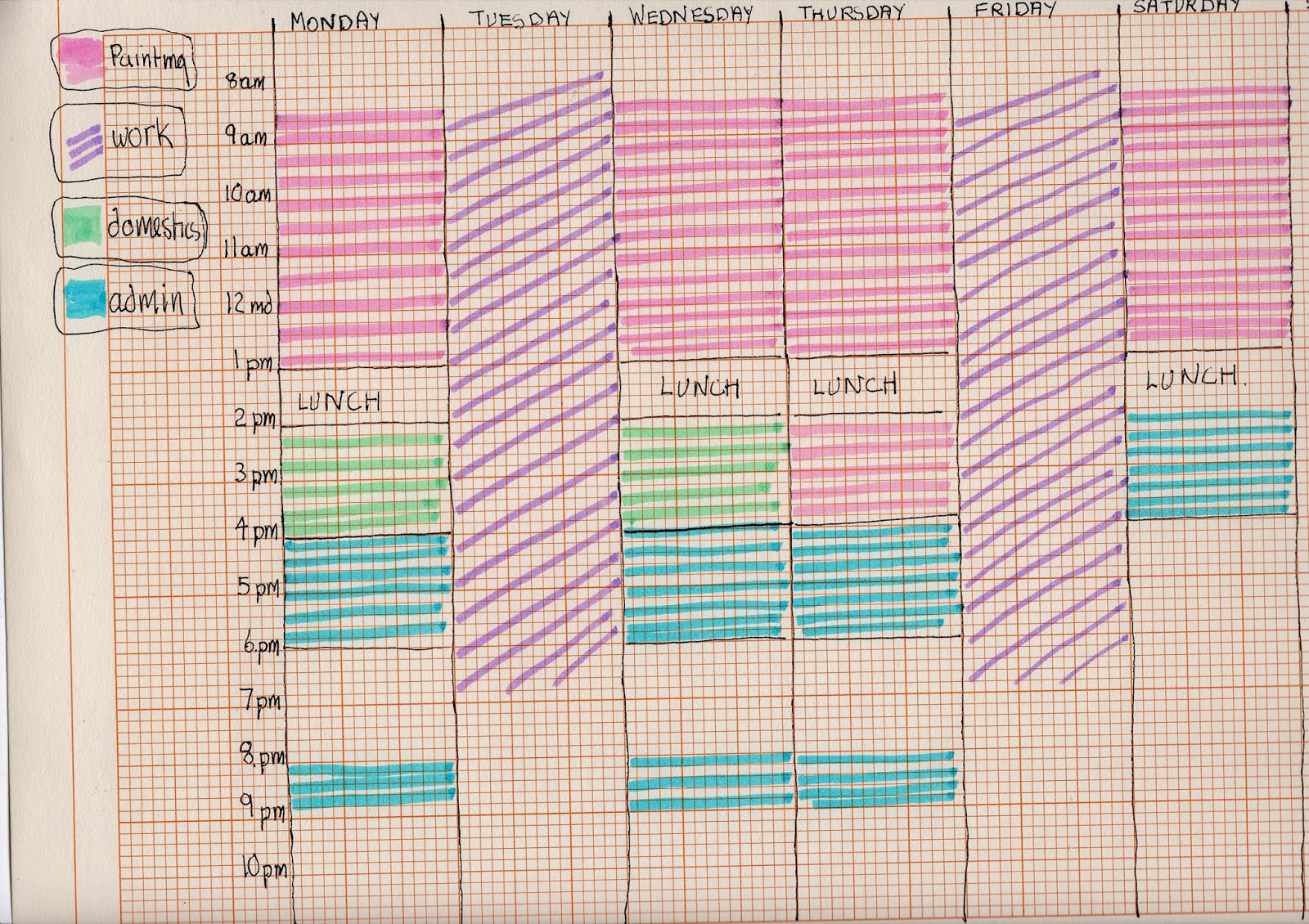
This Artist's Weekly Schedule. A Lifestyle Audit.
I have to 'fess up straight away that this blog is a crib of something I saw on a post by Lisa Call a textile artist who asked "what do you do all week?"
Well what do I do all week? I sometimes wonder!
Have you ever thought what you do all week?
Lisa put us all to shame and set out a nice little timetable to illustrate how she spent her time.
After reading it I felt it was now time to write down in black and white (and pink, and purple, and green and turquoise) what really happens in my week.
Unfortunately this schedule rarely works out as planned and isn't an ideal schedule anyway.
I've never written it down before but had it loosely floating around my brain.
I found the exercise quite sobering and something I thoroughly recommend.
In case you can't read my writing here's the code.
Pink is painting time. Usually morning, the best time for me.
Purple is my other job.As you can see it takes up two whole days and leaves me knocked out in the evenings. I like it a lot (most of the time) but really I'd sooner be painting.
Green is domestic duties. The least said about that the better !
Turquoise is admin. and marketing, writing my blog, connecting with the art world. Thank goodness for the internet. Real life interactions alter my schedule and often take priority.
Sunday is my day of rest where I try not to do anything. I find if I paint all through the weekend I just feel a bit lack lustre on Monday.
After all this I suppose I must draw some conclusions.
Two days of work eats up an awful lot of painting time.
Shame about the domestics.
I'd love to hear your thoughts on the matter.
 |
| Mary Kemp. Cat and Flowers. |
Well what do I do all week? I sometimes wonder!
Have you ever thought what you do all week?
Lisa put us all to shame and set out a nice little timetable to illustrate how she spent her time.
After reading it I felt it was now time to write down in black and white (and pink, and purple, and green and turquoise) what really happens in my week.
Unfortunately this schedule rarely works out as planned and isn't an ideal schedule anyway.
I've never written it down before but had it loosely floating around my brain.
I found the exercise quite sobering and something I thoroughly recommend.
.JPG) |
| Mary's schedule. |
Pink is painting time. Usually morning, the best time for me.
Purple is my other job.As you can see it takes up two whole days and leaves me knocked out in the evenings. I like it a lot (most of the time) but really I'd sooner be painting.
Green is domestic duties. The least said about that the better !
Turquoise is admin. and marketing, writing my blog, connecting with the art world. Thank goodness for the internet. Real life interactions alter my schedule and often take priority.
Sunday is my day of rest where I try not to do anything. I find if I paint all through the weekend I just feel a bit lack lustre on Monday.
After all this I suppose I must draw some conclusions.
Two days of work eats up an awful lot of painting time.
Shame about the domestics.
I'd love to hear your thoughts on the matter.
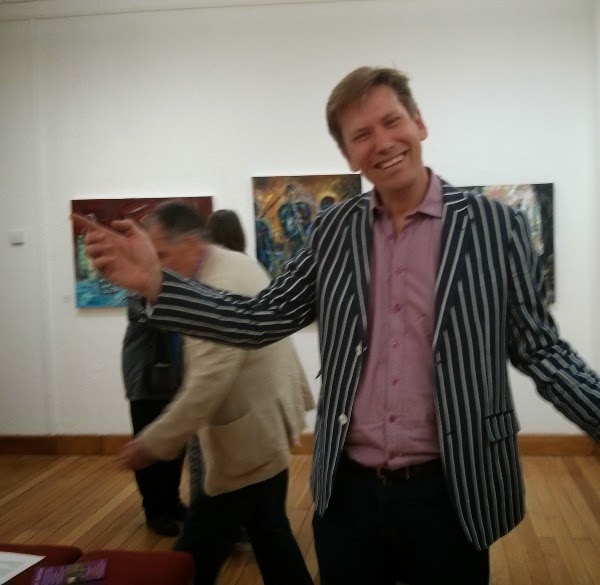
Garth Bayley. Artist in Residence St. John's Church, Peterborough.
My home town of Peterborough is bursting with artists. They're everywhere, in places you would expect them and in places you wouldn't.
So this is a photo of Garth Bayley in the art gallery of the Peterborough museum , a fitting place for an artist, displaying the fruits of a year's work as artist in residence at St John's church in the middle of the city.
 |
| Garth Bayley. Artist. |
I needn't have bothered because they didn't!
Instead we were served up a cornucopia of Christian images in a mixture of media.
Striking were
- The Last Supper, a mixed media picture on paper, seen from above, making it a strikingly modern image.
- Angels and Fallen Angels. Bird wings and clay, a rather sinister interpretation !
- In His Embrace. An oil painting on canvas, typical of Garth's style. This is a part of the continuing debate on same sex marriage.
- From the Cross. Oil on canvas. A powerful image of Christ on the Cross.
- The Wall of Fame. Portraits of people of the church. A joyous bank of portraits.
 |
| Garth Bayley. Wall of Fame. |
When Inspiration Strikes or Things to Do Whilst Cooking Soup or Painting Inspiration.
If there's one thing that gets me it's that inspiration for a painting comes at the most inconvenient of times. Furthermore I don't even know if it deserves the name inspiration, more of a case of "that'll make a nice composition if I just do this, or tweak that a bit." And away you go in a little day dream and something else on the domestic front doesn't get done properly.
My very favourite painting called "French Jug" was born one autumn day as I was doing the washing up, and just happened to look at the early morning sunlight through the kitchen window. I left the washing up and worked all the design out on a piece of paper as quickly as I could because I knew the sun would change.
If only inspiration would come when you're poised in front of a piece of paper or a nice white canvas, and away you go....... Another day dream.
Today I was cooking soup for lunch. The weather is awful, dark and damp. It's not dreadfully cold but it's the sort of day you feel you need the heating on, and a nice cuddly jumper and a bowl of soup.

I looked over to the kitchen table, and there, against all the rules was our ginger and white cat Ginger ( we don't go in for originality on the name front) curled up on the table by a vase of flowers. Not only that he was sleeping on my painting smock !
"That'll make a nice composition," I thought. So I grabbed my trusty Galaxy Note, and did a quick drawing, and also took a photo. It's strange how photos rarely match the picture you see in your head. But I think I have enough to paint a picture from this. I can always put some different flowers in the vase for that part, and I'm sure the cat will sit for me in the same spot again.
Here's a picture of Ginger's brother Zebra painted last year.
 |
| Mary Kemp. French Jug. Oil on board . |
My very favourite painting called "French Jug" was born one autumn day as I was doing the washing up, and just happened to look at the early morning sunlight through the kitchen window. I left the washing up and worked all the design out on a piece of paper as quickly as I could because I knew the sun would change.
If only inspiration would come when you're poised in front of a piece of paper or a nice white canvas, and away you go....... Another day dream.
Today I was cooking soup for lunch. The weather is awful, dark and damp. It's not dreadfully cold but it's the sort of day you feel you need the heating on, and a nice cuddly jumper and a bowl of soup.

I looked over to the kitchen table, and there, against all the rules was our ginger and white cat Ginger ( we don't go in for originality on the name front) curled up on the table by a vase of flowers. Not only that he was sleeping on my painting smock !
.jpg) |
| Mary Kemp. Drawing. |
Here's a picture of Ginger's brother Zebra painted last year.
 |
| Click here for info. |
Holiday Sketching - Why?
Passport. Check !
Tickets. Check !
7 sets of undies and something to wear if it gets cold. Check !
Book to read. Check !
Sunglasses. Check !
Sketching kit. Check.!
Oh goodness me, I nearly forgot the money. Check !
Freedom from everyday life. Throw off the shackles, forget your responsibilities you're on holiday. A week in the sun, lots of sightseeing to do, a mountain of different food to consume and loads and loads of glorious unfettered guilt-free sleep to be had in a bed that you don't have to make yourself.
So why, with this severance from ordinary life would you want to sketch when it's something you do as part of your job. Does an engineer start fiddling with engines on holiday? does a cleaner indulge in a little light polishing while abroad ? does a nurse start looking for someone sick to care for?
And yet as I looked at these examples I realised that for many people what they do is something that is ingrained in them and something they enjoy. I'm married to an engineer and he's always looking to see how things work, and given half a chance will take them apart !
So it's not unreasonable to sketch on holiday. Thank goodness for that !
This time I didn't do many detailed drawings of ships and buildings. It all seemed a bit like hard work, especially after a glass of vino tinto with lunch. So I concentrated on the feeling of the holiday, of finding the colours I saw and when I looked through my sketchbook today I thought, yes, that's what I experienced. Sometimes I get caught up in producing a drawing or painting and not capturing the moment, so on this holiday I did very little but did catch a fleeting feeling or two.
But the answer to why do I sketch on holiday is...
Because I enjoy it of course.
Tickets. Check !
7 sets of undies and something to wear if it gets cold. Check !
Book to read. Check !
Sunglasses. Check !
Sketching kit. Check.!
Oh goodness me, I nearly forgot the money. Check !
 |
| Mary Kemp. Galician Coast. |
So why, with this severance from ordinary life would you want to sketch when it's something you do as part of your job. Does an engineer start fiddling with engines on holiday? does a cleaner indulge in a little light polishing while abroad ? does a nurse start looking for someone sick to care for?
And yet as I looked at these examples I realised that for many people what they do is something that is ingrained in them and something they enjoy. I'm married to an engineer and he's always looking to see how things work, and given half a chance will take them apart !
So it's not unreasonable to sketch on holiday. Thank goodness for that !
 |
| Mary Kemp. Sea at La Corunna. |
 |
| Mary Kemp. View From the Hotel. |
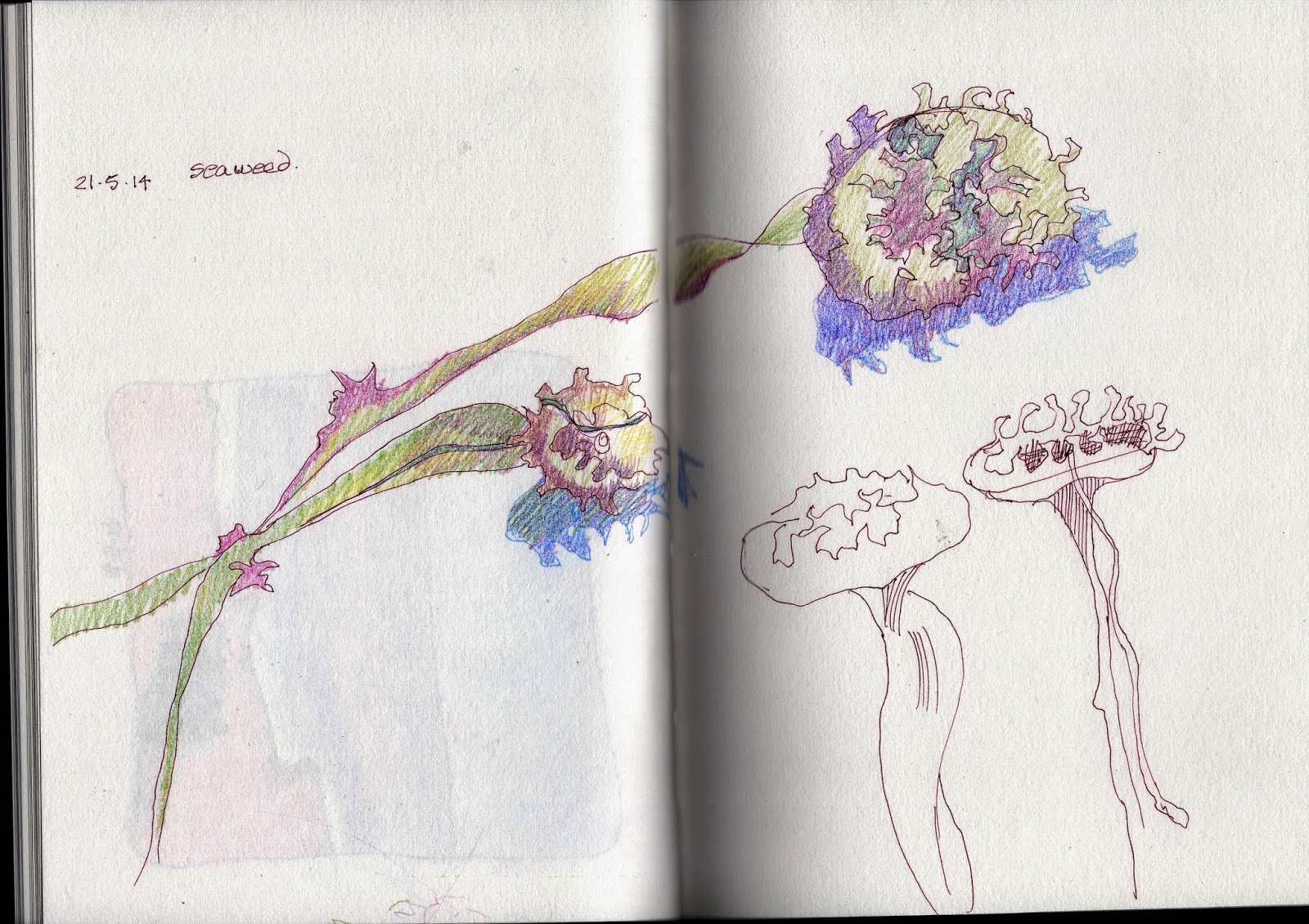 |
| Mary Kemp. Portuguese Seaweed. |
But the answer to why do I sketch on holiday is...
Because I enjoy it of course.
Three Things to Do Six Weeks Before Open Studios.
It's about six weeks to the start of our wonderful Peterborough Artists' Open Studios.
It's getting horribly close and this artist is getting both excited and worried, because after all it's a big thing opening up your studio to the paying public.
And here's three things you can do to get to opening day with a job well done and a sigh of relief.
1. Get together that list of people you're going to invite.
Do you know who they are?
Do they know who they are?
Have you given them information already that this is coming up?
Are they as excited about it as you are?
Have you planned what you're going to say in your call to action invitation and do you know how you're going to deliver it? Via email? via snail mail?
2. Assemble your publicity material .
Posters? Directories/brochures. Your personal invitations. What about a banner?
Our Peterborough Open Studio Committee has produced some wonderful material this year which represents real value for the small fee we pay for being under their umbrella.
Check out this picture !
3. Keep producing art!
That's why you're doing this. After all the whole idea of open studios is to show your artwork to the world, so you'd better have something to show!
Do you know what you want to share with your buying public?
Does it look good ? Do you know how much you will ask for it?
Does it show you as an artist at your best?
Does it represent the little snippet you put in the brochure?
Here's what I put in our brochure.
Best of luck everybody!
It's getting horribly close and this artist is getting both excited and worried, because after all it's a big thing opening up your studio to the paying public.
And here's three things you can do to get to opening day with a job well done and a sigh of relief.
1. Get together that list of people you're going to invite.
Do you know who they are?
Do they know who they are?
Have you given them information already that this is coming up?
Are they as excited about it as you are?
Have you planned what you're going to say in your call to action invitation and do you know how you're going to deliver it? Via email? via snail mail?
2. Assemble your publicity material .
Posters? Directories/brochures. Your personal invitations. What about a banner?
Our Peterborough Open Studio Committee has produced some wonderful material this year which represents real value for the small fee we pay for being under their umbrella.
Check out this picture !
 |
| Banner and brochures. There's postcards and a poster too ! |
3. Keep producing art!
That's why you're doing this. After all the whole idea of open studios is to show your artwork to the world, so you'd better have something to show!
Do you know what you want to share with your buying public?
Does it look good ? Do you know how much you will ask for it?
Does it show you as an artist at your best?
Does it represent the little snippet you put in the brochure?
Here's what I put in our brochure.
 |
| Mary Kemp. Half Term at Southwold. Oil on canvas panel. 50 x 40 cms. |
Click here to see Peterborough's 2014 open studios website.
The Six Primary Colours You Can't Do Without.
Colour excites me!
I'm the sort of person who goes to B&Q on a Saturday and gets lost in the paint aisle, collects those lovely little sample cards and lines them up at home just to look at them.
And in this post I'm going to share a few thoughts about six primary colours.
OK I know there are only three primary colours, red, yellow and blue. But here I will tell you about the six true primary colours that you really can't do without and show you why.
When I first started painting I had problems mixing colours.
I couldn't understand why red and blue didn't always make a true clear purple, yellow and green produced some dodgy greens, and why a red, yellow mix sometimes resulted in a muddy orange.
Of course in some ways this is the joy of colour mixing, but I wanted to make sense of it all.
I simply homed in on the colours that appealed to me and soldiered on from there.
It was not until I discovered Blue and Yellow Don't Make Green by Michael Wilcox, that it all fell into place.
So here's my interpretation of his theory, explained I am sure much better in his book, as well as in this video.
- There are no pure 3 primary colours.
- For the purposes of mixing there are 6.


- Lemon yellow
- Cadmium yellow.
- Cadmium red
- Alizarin crimson
- Ultramarine blue
- Cerulean blue.
Thus the pairings are:
- Lemon yellow and cerulean blue = green.
- Cadmium yellow and cadmium red = orange.
- Alizarin crimson and ultramarine = purple.
I have found Michael Wilcox's book of great value, and well worth a read.
When you've read it you'll realise why 6 primary colours is not such a mad idea after all.
You Don't Have to Visit an Art Gallery to Experience Art or The Girl at the Bus Station.
Sometimes life just serves up a nice little surprise, a little taster that says there's more to the daily grind than just getting by.
Art comes in many different guises, not much of it imprisoned in a frame in an art gallery.
I was waiting for the number 36 bus , in the bus station, surrounded by hoards of noisy school children and tired workers. It was raining and steamy and damply cool.
My brain kept saying "Cup of tea and biscuit., cup of tea and biscuit". I wanted to go home.
Then I saw this girl.
Now I'm not a man, so it wasn't like that, but I am a closet fashionista.
I believe that all life is art, and some people generously make themselves the art and so it's there for us all to enjoy.
And the girl was waiting for the bus, in full make up, with a stylish black beret, tweed coat and mid calf skirt, so immaculate, and tights with seams down the back letting very tattooed legs show.
She was such an curiosity in the drab bus station. So I came home and drew this picture.
 |
| Mary Kemp. Girl at the Bus Station. Digital drawing. |
I hope you like it !
Subscribe to:
Posts (Atom)
How to Care for Prints
Dear fellow art lovers, I'm often asked by busy customers how to look after their prints once they've bought them. Prints are a ...

-
 Sometimes things must change. All my eye wear! For years and years I've been struggling with bi focals, computer glasses and once I...
 -
 Dear fellow art lovers, I'm often asked by busy customers how to look after their prints once they've bought them. Prints are a ...
