Painting of Blakeney Church. (From Roll of Canvas to Painting)


Mary Kemp. Blakeney Church.
Mary Kemp. Blakeney Church. nearly finished.

This is the picture I painted on the canvas I prepared. It feels rather pleasant to paint on. I haven't tried to paint any detail on it yet and I don't know what it will look like when it dries. Still a way to go!

A Roll Of Canvas

Last year I bought myself a roll of canvas with the idea of making my own stretched canvases.
I'm not super fond of canvas to paint on because I don't like the springiness, but I have been using pre-prepared canvas covered boards although the sizes are quite limited.
So the logical thing is to make my own covered boards.
I bought raw canvas which I think wasn't the wisest thing because it needs priming so that is what I have done today. I started with a small board just to try.
I cut a square of canvas bigger than the board and stapled pulled over to the back.
The first effort I had to discard because I'd used large staples and they came right through. The next one I used smaller. Then I primed it with two coats of gesso and that's as far as I've got at the moment. I'm waiting for it to dry.
The canvas is much more luxuriant than the ready made ones, so the next thing I will do is paint on it and see what the outcome is.

Why You Should Keep Track of the Artwork.

When Christmas is over and done with and the world is restored to sanity I plan to be more active in sharing my paintings with the world.
Mary Kemp. Paintings started during "Live Art" at Art in the Heart , Peterborough.
It was a salutary exercise cataloguing all my artwork.
I paint with a one track mind and the only thing I'm concerned with at the time is producing a good painting. When, if, I've done that I loose interest and on many occasions have simply put  the piece aside and carried on with the next one.
It was a shock to find I had so many unseen paintings.
So I am limbering up with a new statement, CV and biography ready to hit 2014. ( I know. It's the art that counts. Why do we have to write about it?)
Meanwhile I have a lovely commission I must finish  which is taking shape nicely so things are looking good.

That Time of Year Again.

It's chilly, it is too grey to go down to the studio today and on top of that I have a cold.
Mary Kemp. Poinsettia in the Kitchen.
So to brighten myself up I drew a poinsettia, like I do every year. I buy my plant at the same shop and bring it home well cellophaned against the bitter winds and it lasts on the kitchen table with very little light and attention well into the new year.
The drawing I executed with an Edding 0.3 profipen and Derwnt Coloursoft pencils.

Priming MDF with Gesso.

If truth were told my favourite surface to paint on is board. I like the resistance of a solid surface and the smoothness and ability to create your own texture. Canvas always seems to give me bumps where I don't want them and the texture from it can be quite a feature. Of course sometimes that great but not always.
Windsor and Newton Acrylic White Gesso
I've been asked to paint a largish painting of a family group at the seaside so I've had my piece of board cut and I've primed it with gesso. I lightly sanded down, wiped carefully then put on 3 coats, probably only needed 2, allowing it to dry between each coat.
When it comes to priming there are all sorts of options. I have been known to use house emulsion but it's not recommended. Usually I look in the art shop or online for a bargain in gesso on the principle that there can't be much difference in a pot of gesso, but I've learnt there is. Some are quite watery, some have lots of texture, which I don't like, and some are horribly shiny. The last pot I had was very good but I threw the container away and forgot to take note.
So this time I bought a large pot of artists acrylic gesso from Windsor and Newton , maximum cover, suitable for both oil and acrylic, and it goes on a dream. It's smooth and beautifully white.
Today I start painting on it. The sun is now up so down to the studio I go!

Landed Exhibition by Sue Shields

On a very wintery evening in Peterborough I attended the private view of a very thoughtful exhibition called Landed, the work of Sue Shields. I have known Sue for some time and always thought her art has great depth to it.
My favourite painting is here.
Sue Shields - Painting.
In Landed her work fills two rooms at the revamped Peterborough Museum. The venue is the ideal setting for Sue's huge paintings, precious copper work many on a sludge green wall and  unusual textiles.

Sue Shields with copper work ready for photos.

More of Keeping Track of the Artwork.

I've started my inventory and am making refinements to the system as I go along.
This is where I'm at.
Each painting I will give a number , and pre-fix it with a letter to denote loosely the category it fits into, for example s for seaside, b for boat and r for random.
I print off the image, write the number on it, and staple it to a 3 x 5 index card. On the front I write, title, size, date, and current framing. In pencil I write where it is on any e galleries.
On the back I write when it goes out to a gallery or exhibition or competition and the price asked. When it comes back I tick it.
I have two boxes, one for available work, the other for work that is out or sold.
Digitally I am creating a file called Ultimate Inventory where the very best image of my artwork goes, labelled by identification letter and number, my name, title, medium and size.
Phew!!!!!

Painting in Public at Art in the Heart, Peterborough.

I've been asked to be part of Live Art Saturdays at the lovely Art in the Heart venue in Peterborough. I'm a bit of a coward and kept putting this off, which is silly really considering you're going to have a nice time and have the chance to talk about your favourite subject, yourself.
Painting kit.
I'm going to paint two seaside pictures, or at least start them. I usually paint in oils but the logistics of transportation and all the mess has made me think I'll use acrylics this time. After all I do sometimes start off a painting that way.
Here's a list of what I am taking with me :

Two pre-prepared boards with the image loosely drawn on. One I've painted red.
Acrylic paint.
Drying time  retartder.
Selection of brushes.
Pencils etc.
Pots for water.
Palette.
Kitchen roll.
Cling film.
Apron and glasses.

If Only I'd Worn the Computer Glasses.

I know it sounds stupid but I visited the Cambridge Art Fair last week and didn't take the right glasses with me.
Let me explain. I've been short sighted all my life and now I'm long sighted as well. As a rule I get on fine out and about with bi focals, I can't get the hang of varifocals. For indoors , art work, cooking, computer work a pair of middle distance specs does the trick, but I rarely take them out with me, just something else to loose.
So when I went to the art fair, and later popped in to the Fitzwilliam Museum I was struggling to get the right distance from what I wanted to see plus the light was rubbish because it was a dull day and the lighting was all conservation biased.
How I long for sunny days and the great outdoors.
Mary Kemp - Poppy Field Last Summer.
Oil on canvas 30 x 30 cms.

On the Rocks. (I Paint in Twos.)

I paint in twos quite often. If I can't decide which way I want a painting to go I'll start two from the same beginning.
Mary Kemp - On the Rocks. x2

This is a scene from a family holiday in the Canaries, the sea was deep and churning. It reminded me of Cornwall.
I used different grounds for the paintings. The first my usual canvas panel, quite a smooth weave, the other was on a natural coloured coarser primed stretched canvas. I'd bought 4 of them when they were on offer at Great Art.
The latter I finished quickly, the neutral ground helping and also having a fresh perspective to a familiar subject.
The painting on the white canvas I will tackle today.

Colour and Light in Oils by Nicholas Verrall.

One of my favourite modern day painters is Nicholas Verrall. His composition and use of colour just wow me, so his very informative book Colour and Light in Oils is a book I refer to often. I also have a couple of catalogues from shows  at the Catto Gallery in Hampstead.

Why Drawing is Important

Mary Kemp - Drawing of a Field.
If you're a visual artist one of the crucial tools at your disposal is the ability to draw. Not all visual disciplines require you to draw well, but it's useful to get information down on the page, to work out your ideas and plan what your finished art work is to be.
I think of myself as a painter, and if I carry on painting without doing much drawing, all of a sudden I come up against a brick wall, fresh out of ideas and can't get things to look how they ought to look. And now I know it's time to get back to the drawing board.
So yesterday morning the sun shone, I went out into the countryside and drew a field.
 For this I used my eight inch square spiral bound sketch book, various pens, two of which ran out of ink, but the brown one kept going, and a selection of Derwent Coloursoft pencils.

Keeping Track of the Artwork

It is a sad fact that my art is not snapped up the minute it leaves the easel.
Therefore I need a system for keeping tabs on it. Over the years I've had several goes at this with limited success.
Files on the computer are essential for preserving images and data about the work, but it takes time to locate and you can't keep a lot of info with the image.
Mary Kemp - Filing system?
So my latest idea, one I've had boiling in my brain for a while, is a digital inventory but with an old fashioned card index where I keep data on the life of the artwork.
I also have a little book with each venue and occasion and what I have there.
Is that enough?

The Studio Handbook by Martin Kinnear.

After two brilliant sessions at the studio of Martin Kinnear I am definitely a fan.
I attempt to paint like him but I think my work is just a bit too light weight to match up to his skills. Never the less I have learnt an awful lot from his courses some of which I have applied to my own work, but I have to say it deflects me from my main thrust which is light and happy and dare I say just a bit frivolous. Jack Vitriano says he keeps away from other art because he doesn't want to be pushed off course, and I kind of get what he's saying.
However this little handbook by Martin Kinnear is very useful, full of technical information and a great addition to my studio.

Masterpieces, Art and East Anglia at the Sainsbury's Centre, University of East Anglia.

My favourite game to play when visiting an exhibition is pouncing on something I would like to take away with me. But there was so much at this exhibition to love I never got to make up my mind.
Part of the fun was the venue, breathtakingly modern at the University of East Anglia. (Did it feature in a Most Peculiar Practice on the telly in the 80's, 90's?)
The art spanned pre history to the present day.
My husband wanted to take home Christopher Saxton's map of Norfolk from 1574, quite portable if only you could get into the cabinet without being noticed.
Despite there being a cornucopia of artefacts I still lusted after a couple of paintings, a Munnings Suffolk Horse Fair and a bright fresh Cotman watercolour that could have been painted yesterday.
Sainsbury's Centre UEA
Happy day out.

Tea at the Garden Centre.

The weather was awful, although improving.
Jean and I had planned a day out sketching. We spent a little time in Peterborough Central Park but it was cold, so we decamped to the Van Hage garden centre to the north east of the city and before we indulged in a bit of retail therapy we had lunch and drew life in the cafe.
Here's my contribution.
Mary Kemp - Cafe Sketch

For Speed Choose Acrylics.

I had an idea in my head, a rework of the painting I'd just finished, and not a lot of time.
What to do?
Out came the acrylics.
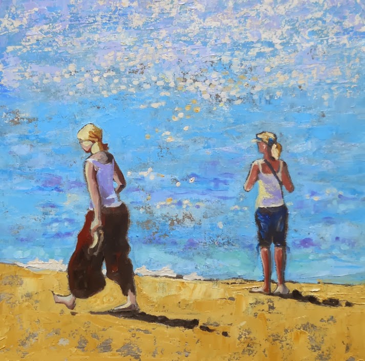
Mary Kemp - "I'm at the Seaside With the Children"
Acrylic on canvas panel 30 x 30 cms.
First I put down a purple ground and after a cup of coffee drew the image and then started painting, blocking in the sea and sand and then the figures. It all sounds so simple.
The joy of acrylics is there is so little drying time.

Wish List for the Ideal Studio.

As Virginia Woolfe said "every woman needs a room of her own", or every artist needs a studio of their own.
Which got me thinking about the ideal studio, and this is the wish list I came up with.
My studio, not perfect but pretty good.
Essentials
  • Close to home. Ideally walking distance, possibly in the garden, but for me not in the house because domestic life gets in the way of painting.
  • Plenty of bright clear light, either artificial if you must, or large windows for natural light. Many artists say north light but the brightness from a south facing window is useful as long as you can filter it with either blinds or paper.
  • Electricity.
  • The studio must be warm, but capable of a lot of ventilation in the summer.
  • Which brings me to good ventilation, you don't want to expire because you've inhaled too many chemicals.
  • It must be clean. Who does that is the difficult part.
  • It must be quiet or if it's not have only noises you want to hear, e.g. crashing waves, trees rustling in the breeze.
  • Easel, seat, table or flat surface, and storage.
Desirable but not Essential
  • So much space you could hold a party in it. I wish!
  • Telephone. Or you could use your mobile.
  • Internet and computer.
  • Running water. I would love this.
  • Comfy chair.
  • Mirror.
  • Radio.

Vibrant Acrylics by Hashim Akib

There are several books that I keep in my studio and this is one of them.
I don't often paint using acrylics, they dry when I am not looking.
But acrylic methodology can be useful for the oil painter, pushing you out of your comfort zone of careful painting . Also acrylic painters often operate in the realms of high colour even though acrylics are quite capable of subtle tones.
This book is a joy of vibrant colour, as it says on the cover.
It takes you through several exercises, producing a painting full of life at the end of each chapter. There is lots of broader advice, composition, materials, that sort of thing  and loads of inspiratonal encouragement.
The main thing I have learnt from this book is the use of strong coloured grounds in a painting. Having bright red or strong cobalt blue really peps a painting up.
I  bought this from Amazon, of course, as recommended by the Artist and Illustrators magazine.

Why Doesn't Fiction Have Illustrations with the Text.

Why doesn't grown up fiction have illustrations with the text?
The Island of Adventure by Enid Blyton, illustrated by Tony Soper,
one of my favourite childhood reads.
Well really and truly I know the answer. It's cost.
But what a joy it would be to have just a few pictures with a glimpse of the characters and settings to fire the visual imagination, perhaps point us in the right direction.
An illustration could set the tone of a book even before you'd read it, set some apart from others, even lift the prose into a higher sphere.
As children we see pictures in every book we read, as an adult we're cheated of this small joy.
I don't think I want photographs, too specific, but a black and white line drawing, if colour is too costly, would add a great deal to my enjoyment.

Not Here , Not Now !

I painted this picture in response to a little scenario that was happening on the beach. I was not part of it so can only guess as to the story behind this frosty atmosphere.
Mary Kemp - Not Here - Not Now.
oil on canvas panel 30 x 30 cms
 I was very pleased when this painting found a new home and someone else can spend hours speculating as to what is going on.

The Importance of Consistency

Mary Kemp - Beach Scene -
 oil on canvas 30 x 30
Sometimes you get tired of painting in the same old way. One sunny beach scene after another, exploring every little nuance of a great day out.
Then you fly away from what is the core of your artwork and do something really mad and not at all how you usually paint . It's fun and opens up new avenues.
And then all of a sudden you realise that you've just got to get back to the job in hand and a beach scene calls, fresh as a summer's day, the smell of the sea on a gentle breeze and you can hear the children calling and a few sea gulls, and off you go into the world of blue skies and golden sands. There's this drawing I did of  a family amongst the rocks, and of course people walking out of the sea.
New beginnings.
Mary Kemp - Beach Scene -
early drawings
Onwards! Onwards!

The Wonders of Modern Technology for the Artist.

I have a dear friend Jean, an accomplished watercolourist. This is her website.
Sometimes we chat on the phone while I'm in the studio. It's quite nice to hear a friendly voice when you're working.
Yesterday I was struggling with a particular painting and decided to take a photo  of it and email to Jean while we talked. So we had a nice discussion and she came up with several brilliant ideas, which makes my  painting look a lot more real now.
When it's finished I may post it on this blog, but meanwhile here is one of Jean's lovely, delicate watercolours.
Jean Edwards - Colours of the Landscape. Watercolour.

Frank Auerbach

An insight into the everyday lives of renowed artists is always fascinating, especailly if you like to think of yourself as an artist too.
Frank Auerbach Head of EOW IV
National Gallery of Scotland
The one thing that that seems to stand out most is an absolute dedication to art leaving not a lot of room for anything else. Of course this could just be what they want us to believe, and it's really not all practice, practice, throw away ten pictures, keep one, don't stop for coffee and never ever hoover the living room. But I suspect hard work is the key after all!
In the Daily Telegraph I read an article about Frank Auerbach . And all he seems to do is paint.
I would put up a link to the article here but I couldn't make it work.
Auerbach is not one of my favourite artists, I can't cope with too much paint but his work in real life is striking and you don't have to like the work to admire it. He paints a handful of sitters over and over, so it is not a solitary life, just one that is quiet and safe and surrounded by friends.

Something Else I've Learnt.

It never stops amazing, and depressing, me how much I've yet to find out.
This is so simple, and I really ought to have known it.
When I take a photo on my phone and don't want everything to be washed with an even light all I have to do is point the lens at the sky, hold the button down, and then point it at the thing I want to be seen darkly, and release the button.
I'm sure everyone knows this but me.
Here is my latest project, the first taken as it is, the second using the sky pointing method.
Mary Kemp - Ferns
 Looking at them there's still a lot of work to do.
Mary Kemp - Ferns.

Forest Path

I spent a lot of time in the woods last winter, gathering ideas and taking photos.
 It takes a time for ideas to perculate through hence only starting to paint these scenes now. I think in the summer my mind was taken up with sunshine and the beach. I definitely feel a bit darker now. 
I started this painting on a pristine white primed canvas panel 50 x 40 cms, drew in the the v. rough outline with an hb pencil.
Mary Kemp - Forest Path oil on board 50 x 40 cms
 Lots of cadmium red - first of all I used Winton student colours and then found the tube of proper artist's quality oil paint by Windsor and Newton and the difference in intensity of colour was striking.The dark colour I used paynes grey and purple and a bit of cadmium red.
Mary Kemp  - Forest Path , oil on board 50 x 40 cms.
I let it dry, then added some white and grey and purple for the sky, and now I'm off to carry on some more because looking at this image has jolted me into seeing what needs doing. ( See the black and white photo I'm using for reference)

Dark Landscape

Sometimes the day is so heavy that the air seems thick and deadly as custard. I painted this picture after such a Wednesday.
Mary Kemp - Heavy Day
Oil on canvas panel 50 x 40cms

Is It Finished Yet?

I have no idea whether this painting is complete or not. I'll let it hang about for a while and see what I think. It's beginning to grow on me.
Mary Kemp - Forest Floor -
Oil on canvas panel 50 x 40 cms.

Recipe for a Painting. 2.

Picture 3 - Mary Kemp - Forest Floor
I have spent another morning trying to lick this picture into shape, as well as starting on another painting of the allotment. I have added a lot more cadmium red to the trees and defined the shapes of the foliage more. I also experimented with some cadmium yellow and white on the red of the ferns. I'm in the middle phase of this painting where not an awful lot seems to be happening.

Recipe for a Painting.

Damp forest floor with sun struggling to get through. Should I call it "Struggling Sun" or "Fetid Forest"? There have been several versions of this image, none of which I've been a hundred percent happy with. So I'm trying this for the umpteenth time with a broader approach, in the search for the Nirvana of paintings.
Here's the recipe so far:
Picture One. Mary Kemp . Forest Floor
Picture one; Primed canvas panel with image roughly drawn with HB pencil.
Sky roughly blocked in with a mixture of liquin thick medium, a small amount of spirit and white and Paynes grey oil paint. ( This mixture dries quickly and is quite shiny)
Trees were scumbled in with a mixture of Paynes grey and ivory black  plus a trace of ultramarine violet. Scumbles of cadmium red for the ferns and sap green for the leaves.
Picture Two. Mary Kemp. Forest Floor
Picture two; Most of the work I did at this stage was on the dark passages of the trees and forest floor using Paynes Grey, ultramarine violet and some alizarin crimson. I used a smaller brush and defined the shapes of the leaves and trees.

Autumn Leaves.

Mary Kemp - Autumn Leaves
Oil on canvas panel 30 x 30 cms.
I've just finished painting this picture. Can you see the bit of red paper? one of many that I sprinkled to see where I wanted the leaves in the painting to go.

Oh Dear, Composition, Planning and All That.

Mary Kemp - Houses Through the Trees.
Oil on board 70 x 50 cms. 
In case you haven't guessed I struggle with composition. I usually know what I want to depict, how I want the painting to feel, and then I settle down to planning it. Except I don't plan as well as I should do and dive in before I've resolved essential elements, like where the darks and lights go, where are the points of interest and the thrust of lines.
I have on occassions mapped out a painting meticulously but then it looses something. My best paintings are those where I conceive the idea quickly, do a brief sketch and then get on with it, and all goes well.
I won't ask you to guess how well I thought this one went.
I started with a drawing on a red gessoed board, put in all the darks, and some more, using ivory black mixed with spirit and Liquin, let it dry, and then started adding the clouds with transparent earth red, pink brown and a little bit of black. Later I added the light with white, cad yellow and used Neo Meglip a smoothing agent. Back to the dark bits, and mixed in some green in the foreground. I'm still not 100 per cent happy with it and I think there's more work to be done. However like many things it looks more finished when it's photographed.

Taking a Photograph of an Oil Painting with Lots of Black Shiny Areas.

I like to photograph my work and this particular picture presented me with a lot of problems. For a start it's long so I had to stand well back in order not to have the sides bow in, but most of all it's shiny and black shiny does not come out well in photos, it comes out as speckley grey.
Mary Kemp - Eastfield Allotment - oil on canvas 60 x 30cms
I used a polarising filter and took the photo out of direct sunlight but I'm not sure if I was very successful with this. I did photoshop it a bit too.
The black looks a lot blacker in real life. If the black were matte it would be a better photograph but I suspect not quite such an exciting picture.
It now resides at Art in the Heart in Peterborough.

Into the Dark

I've been experimenting a lot recently with darker paintings. I like light and sunshine and happy days but life is not all about that, at least my life isn't, and I wanted to paint pictures with a more sombre feel to them. It could be something to do with impending winter even though it's still quite roasting outside.
Mary Kemp - Trees at Ferry Meadows Cafe.
Oil on canvas panel 30 x 30 

Autumn Paintings

I have three paintings on the go at the moment, well four really. Sometimes you just want to get on with them all and have ideas buzzing round your head.  I am striving to get them ready for
 Art in the Heart's autumn stock. Trees and my allotment are the inspiration.


Two New-to-Me Colours

Whenever I encounter a different way of working I seem to discover new colours. You'd think by now I would have found out about every colour, tone , shade under the sun, but of course I haven't. I certainly haven't used them all.
Transparent Earth Red and Brown Pink
When I attended the  The Norfolk Painting School I came across two of the most delightful transparent colours I have ever seen, transparent earth red and pink brown, or is it brown pink? Anyway a colour I had previously instantly dismissed because it contained the word pink. How wrong can you be. 

Such a Simple Way to Save Money for Artists.

No ! No ! No !
This tip is so simple, such a no brainer that I don't know why I don't do it every time I paint. 
But I get carried away in the moment , and there I go discarding lids right left and centre, dropping them on the floor, throwing them away with rags, letting them fall to the bottom of a box never to be seen again. If only I would put the lids back on tubes of paint, pots of paint, jars of primer, bottles of medium, bottles of spirit. And ideally wipe them first so they go on properly and seal. 
Then I wouldn't be digging out paint with a dodgey pallette knife or worse still cutting the tube in half using paint encrusted scissors.  I spend a  fortune on dried up materials that don't even make it onto the canvas.
From now on I will have a notice in my studio saying PUT THE LID ON !!!!

Norfolk Painting School

Being a starving artist I am a bit cautious about where I spend my money. I want value for money, which is why  after attending a very successful two day course a few years ago at the Norfolk Painting School of Martin Kinnear I decided it was time I invested some more of my hard earned cash in a few days of  training . 
The lessons I learnt from the first visit to the studio helped my work progress enormously so I came to the Light and Atmosphere three day course full of anticipation. And was not disappinted.
We worked hard, very hard. No standing around chatting, just detailed instruction , followed by painting with a definite purpose of a project to complete, each stage having been explained in detail.
After the three days I came away exhausted, my head full of loads of new information and four

Vanda - studio assistant.
pictures under my belt, two of which I quite liked. (The picture from my first course I sold  recouping my fees nicely)
I feel these three days have influenced my work no end. There was a lot of theoretical information which made sense of the methods and materials we were using. We were well fed, our pallettes were cleaned! and the atmosphere was business like and friendly. 
Thank you Martin for inspirational instruction, Jane for organising it all, Vanda for being a reassuring studio assistant and Lucy for fabulous lunches.

Handy Tip For Oil Painters.

I have just come back from a three-day course at the wonderful lNorfolk Painting School (more of that next time) and one of the many things I learnt was that if you put baby oil on your hands after painting all the nasty oil paint disolves and you can wash your hands in soap so much easier.
Of course I learnt a great deal more serious and important things than this but little tips about studio practice are amazingly helpful.

What to Paint For Autumn..

The next season will be autumn. Already the nights are drawing in and the Persieds meteor showers are upon us, and the new term for school is just a few weeks away.
So I must paint some autumn pictures because I'm beginning to feel just a bit sad and nostalgic already for the summer's passing.
Mary Kemp - Autumn at the Allotment, Last Year.
This is painted on canvas with lots of texture. I went heavy on the alkyd gel which has the added advantage of drying really quickly. There's more to add, possibly I'll sneak a dog in.

Sketching on the Beach

Oh joy! Off to the seaside. Family and dog. I did get a chance to do a bit of sketching. Ideal conditions of warm air and no wind. I sat on the beach while chaos was all around. Out came the sketch book, pen and coloured pencils and this is what I drew.
Mary Kemp - Woman on the beach.
Pen and coloured pencils in sketchbook.

How to Care for Prints

Dear fellow art lovers, I'm often asked by busy customers how to look after their prints once they've bought them. Prints are a ...